Creative Resume Templates
A creative resume template uses colour, shapes and layout to show personality before anyone reads a word. MakeCV's Creative template has a purple-to-cyan gradient header with content in cards; Bloom is softer, with a cream page, pink accents and small emoji icons beside each heading. Both are free to download as PDF.
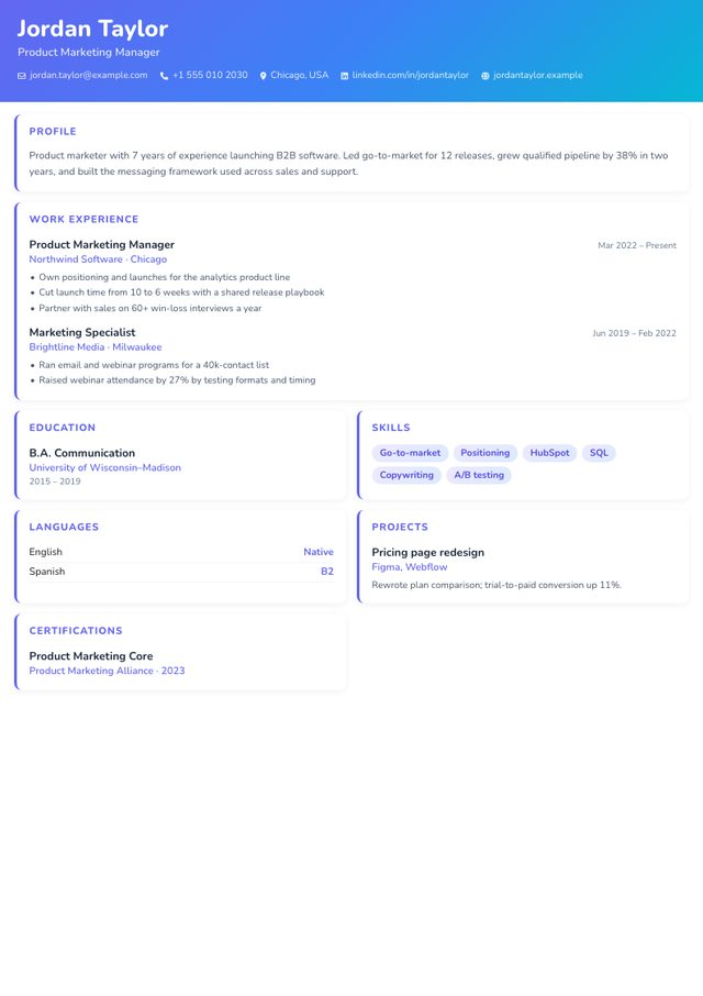
- Layout: Gradient header + card grid
- Photo: Optional, round, in the header (nothing shown if you skip it)
- Look: Purple-to-cyan gradient, cards
- Suits: Design, content, social media, events
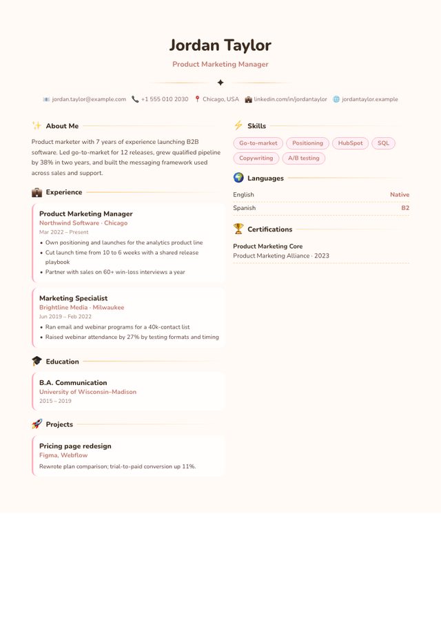
- Layout: Centred header + two columns
- Photo: Optional, round (nothing shown if you skip it)
- Look: Cream page, pink accents, emoji section icons
- Suits: Early-years education, beauty, hospitality, creative freelancers
When a creative resume is worth it
- The role is creative or audience-facing: graphic or UX design, content, social media, events, brand marketing, hospitality, beauty, early-years education.
- A person opens the file first: you are emailing a studio, replying to a recruiter, applying through a referral, or handing over a printout at a portfolio review.
- The company's own brand is playful. Look at its careers page; if it is full of colour and illustrations, a bold resume fits.
When to choose something calmer
- Applying through a portal that parses your file (most medium and large employers). Use Classic there.
- Conservative sectors: banking, law, insurance, government.
- Senior leadership roles, where Executive sends a better signal.
Creative vs Bloom
| Creative | Bloom | |
|---|---|---|
| Header | Full-width purple-to-cyan gradient with name, title and contacts in white | Centred header with a round photo and your name in bold rounded type |
| Body | Summary and experience full width, then a two-column card grid | Two columns: experience on the left, skills and languages on the right |
| Headings | Uppercase coloured labels | Headings with emoji icons (✨ About Me, 💼 Experience…) |
| Feel | Energetic, digital | Warm, friendly |
| Best for | Design, content, events, startups | Hospitality, beauty, childcare, wellness, freelancers |
Bloom's emoji headings are charming on screen, but some parsers turn them into stray characters. Another reason to keep a plain version for portals.
Make the content as strong as the design
A bold layout raises expectations. To meet them:
- Link your work. Add a portfolio, Behance, Dribbble or personal website in the "Website / Portfolio" field; it appears in the header.
- Use the Projects section for two or three pieces of work with a one-line result each ("Rebrand for a local café; foot traffic up in the first quarter").
- Keep text short. Cards look best with two to three lines each. Long paragraphs break the visual rhythm.
- Pick a photo carefully, or skip it if you apply in the US, UK or Ireland. If you leave it out, the photo area disappears rather than showing an empty frame.
The two-version strategy
Fill in your details once, download the Creative or Bloom PDF to send to people, then switch to Classic and download the ATS PDF for online forms. It takes about a minute and removes the risk of your design costing you an interview. More in the ATS resume guide.